23
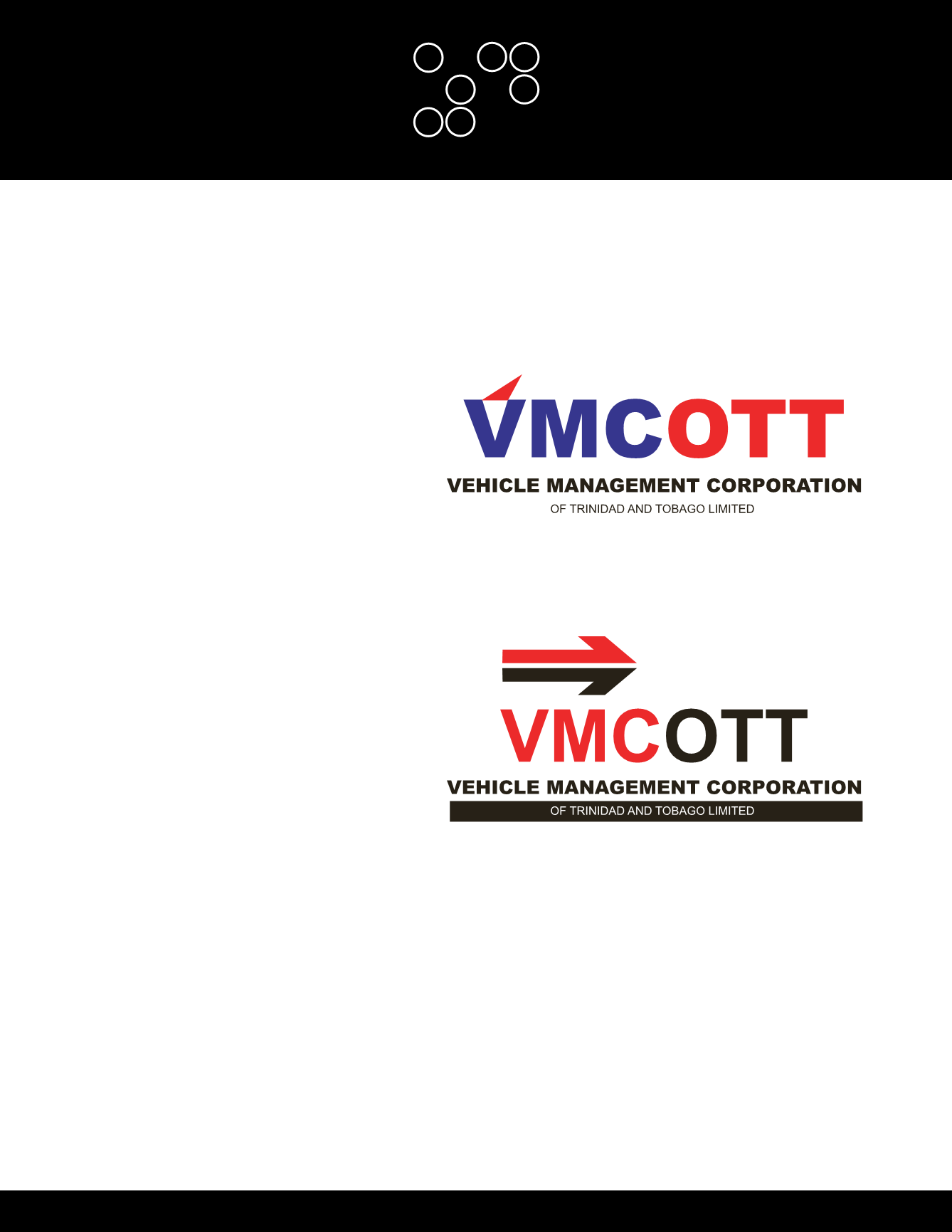
Concept 1
(approved)
This logotype
was designed to be simple and clean. It
highlights the VMC (Vehicle Management
Corporation) in a bold electric blue with the
font type square and almost mechanical,
showing precision and definition. It is
accented with a bright orange ‘swoosh’ to
the top of the first letter to demonstrate
dynamism and forward mobility. The shape,
even though inverted, leans to the right and
is the sysmbol for ‘greater than’ - portraying
advantage (in the services offered).
Concept 2
The National Colours are
prominent in this design, the graphical
element: a forward arrow, depicts sustained
progress and utilizes the strip of the National
Flag to illustrate proud ownership by the
citizens of Trinidad and Tobago.
The VMC of the logo type are in contrast
to the OTT highlighting the able purpose of
your corporation and the words are spelt out
beneath the main design. This configuration
is meant to be precise and clear while
illustrating the strength and commitment of
your organization. Holistically the emphasis
of the design is meant to show dynamism
and advancement of service.
VNCOTT LOGO
CONCEPTS


