18
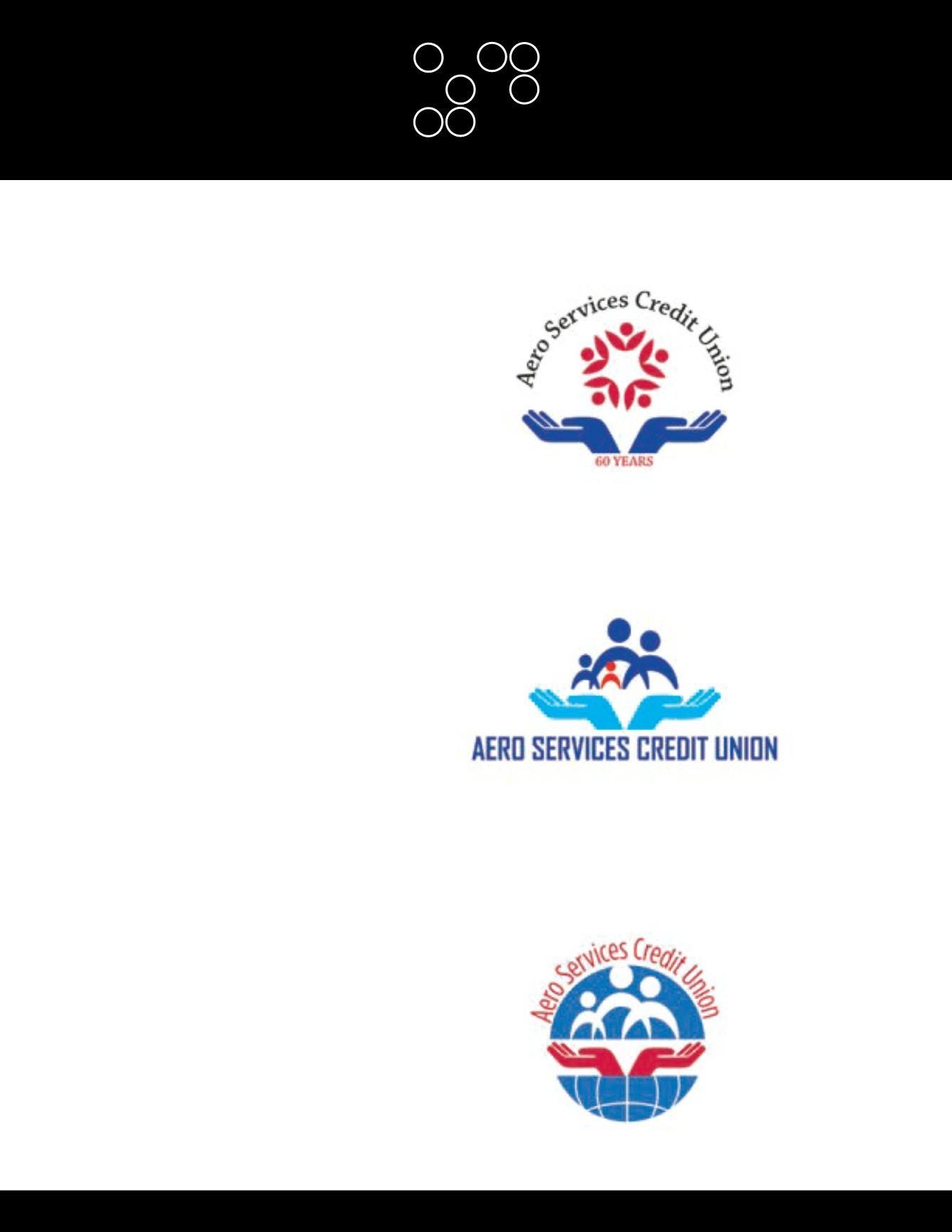
To ensure duality not only to the Aero Services
Logo but to international standards as well, three
elements remain common in all three proposed
designs:
The Globe:
symbolizing the power of unity and the
international networks of the organization.
The Hands:
representing the self-help nature of
the credit union, success lays in the hands of its
membership.
The Basic Family Silhouette:
the people and
community of the credit union working together for
mutual benefit, this distinguishes you from all other
financial institutions.
AERO SERVICES
CREDIT UNION (ASCU)
LOGO CONCEPTS


